

📌 Key Takeaways
Picking coated or uncoated paper is only the first step — the real choice depends on matching specific sheet properties to what your printed job needs to look like.
- Start With the Printed Result: Define what the job must look like first, then find the paper properties that support that outcome.
- Smoothness and Formation Differ: A sheet can feel smooth yet still print unevenly if its fiber distribution is inconsistent underneath.
- Ink Holdout Shapes What You See: How much ink stays on the surface controls color richness, sharpness, and solid-area quality — and it varies even within coated grades.
- Opacity Beats Brightness for Two-Sided Work: A bright sheet can still show through badly; opacity is the property that actually controls reverse-side bleed.
- Print a Sample, Don’t Trust the Label: Data sheets help you compare, but only a printed sample under real conditions proves the paper works for your job.
The category name narrows the field — the printed sample closes the deal.
Print buyers and production teams specifying sheetfed offset stocks will find a property-by-property evaluation method in the detailed guide below.
~ ~ ~ ~ ~ ~ ~ ~ ~ ~ ~ ~ ~ ~ ~ ~ ~ ~
A buyer comparing coated and uncoated sheets for a sheetfed offset job may be starting with the wrong question. “Which category is better?” treats two broad labels as though they contain everything a print specification needs. They do not. Two offset papers that share the same category label can produce noticeably different visual results because their surfaces and optical properties differ. The more useful starting point is the intended printed result: what the job needs to look like, and which measurable paper characteristics support that outcome. Paper is not the only variable in the equation (ink, press setup, screening, and production conditions all contribute), but paper selection is the variable the buyer controls earliest. While this evaluation focuses on surface and optical properties, buyers must also specify the correct basis weight and caliper (thickness) to ensure the piece folds cleanly, meets postal requirements, and feels structurally appropriate. The practical method is straightforward: start with the result, identify the relevant properties, compare candidate stocks, and verify with representative samples.
First Define What the Job Needs to Look Like
Before opening a single data sheet, write down the visual and functional requirements the printed piece must satisfy. Six questions will focus the evaluation:
- Does the job contain fine type, small graphic detail, or thin rules that depend on sharp reproduction?
- Does it include continuous-tone imagery or detailed photographic content?
- Are there large solid ink areas that need to appear smooth and uniform?
- Is a deliberately smooth or deliberately tactile surface part of the design intent?
- Will the piece print on both sides, making show-through a concern?
- Does the job depend on a particular paper shade or color background to support the intended visual impression?
Each answer points toward a different set of paper properties. A job that combines several of these requirements will need a stock that balances competing demands rather than optimizing for only one. Capturing the requirements first prevents the common mistake of comparing papers on specifications that have little relevance to the actual job.
This is also where procurement and production need a shared language. Production may describe the requirement visually: sharper small type, more even solids, less reverse-side interference, or a warmer sheet. Procurement then has to translate those observations into paper characteristics that can be compared across candidate grades. Without that translation step, both teams may agree on the goal while evaluating different properties.
For readers ready to formalize these criteria into a structured evaluation, the process of building a buyer-owned offset paper specification extends naturally from this starting point.
Surface Character: Separate Smoothness from Formation
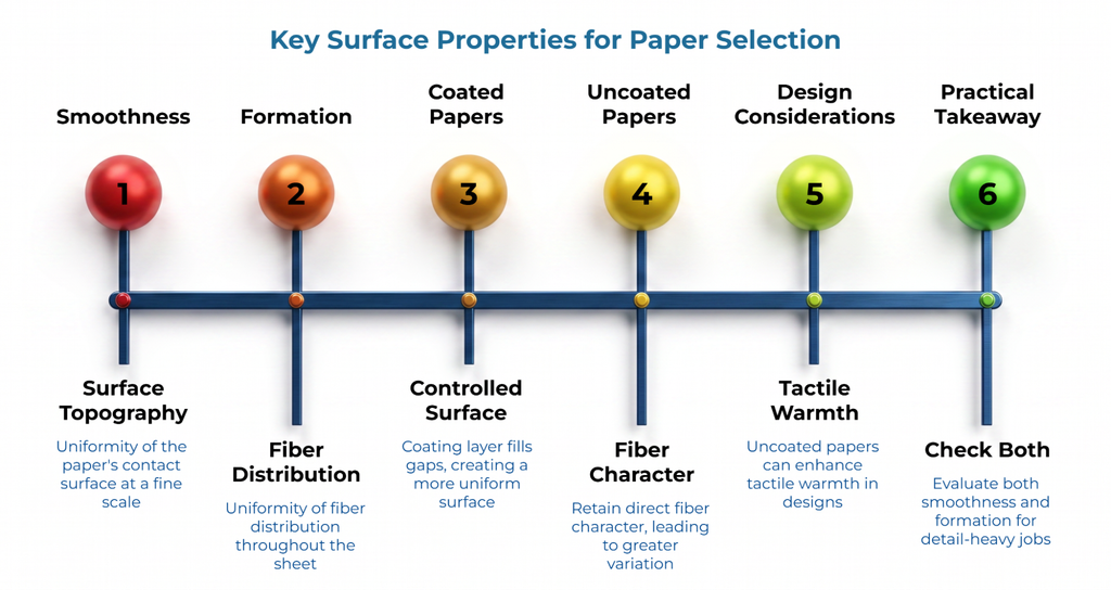
Surface character is the overall tactile and visual impression a sheet creates: how it looks, how it feels, and how it interacts with light before any ink reaches it. Two properties contribute to that impression in different ways, and confusing them leads to specification errors.
Smoothness describes the surface topography of the sheet, the degree to which the paper’s contact surface is level and uniform at a fine scale. A smoother surface generally provides more consistent contact with the printing blanket, which can support finer detail transfer and sharper ink edges.
Formation describes the uniformity of fiber distribution through the sheet. A sheet can feel smooth to the touch yet still have uneven formation, meaning the fibers are distributed unevenly when the sheet is held to light. Poor formation can show up as a mottled or inconsistent appearance in printed solids and tonal areas, even when the surface itself measures as smooth.
Coated papers typically provide a more controlled, uniform surface because the coating layer fills gaps in the base sheet. Uncoated papers retain more of the direct fiber character, which means greater variation between grades. That variation is not always a disadvantage. Consider a hypothetical editorial publication designed around tactile warmth: the design intentionally calls for a softer, more textured sheet character. In that scenario, an uncoated stock selected for its surface feel may serve the design better than a high-gloss coated sheet that fights the intended aesthetic. Maximum smoothness is not automatically the correct optimization target. “Coated” does not mean “higher quality”; quality is fit for the intended job.
The practical takeaway: when evaluating candidate papers for a detail-heavy job, check both the surface smoothness and the formation quality. They answer different questions about how the printed image will appear.
Ink Holdout: Ask What Happens at the Paper Surface
Ink holdout describes how strongly ink remains on the paper surface rather than penetrating into the sheet structure. The degree of holdout influences visible ink density, apparent sharpness, color saturation, and the uniformity of solid areas. Absorbency and surface treatment also play a role in how ink interacts with the sheet.
Consider a hypothetical detail-heavy marketing piece containing fine type, detailed images, and clean graphic edges. A buyer might assume that selecting any coated stock will guarantee sharp reproduction. In practice, two coated grades can differ meaningfully in surface smoothness, formation, and ink interaction, so the buyer still needs to review the specific grade’s characteristics and evaluate a representative printed sample. The category label alone is not sufficient.
A surface with higher holdout tends to keep more ink pigment at the top of the sheet, which can produce denser, more vivid printed color and crisper edges on fine detail. A more absorbent surface allows ink to spread and penetrate further into the fiber network, which may reduce perceived sharpness and visual ink density. This physical spreading of the ink dot is known in the industry as dot gain, and it is a critical factor when printing complex mid-tones. Neither behavior is inherently superior. A high-holdout surface that creates intense color density may be right for a photographic piece but less appropriate for a text-heavy document where excessive surface ink creates readability problems or set-off risk.
When offset paper exporter or supplier information is unclear about a grade’s ink interaction, convert that gap into specific questions. Ask what property is being reported, what unit or measurement basis applies, what test or measurement method was used, and whether the sample supplied represents the actual grade being considered. These questions turn vague supplier descriptions into comparable information.
Holdout is only one variable in the equation. Ink formulation, press speed, impression pressure, and screening characteristics also affect the visual result. If a printed result looks wrong, the cause may not be the paper at all; press setup and job variables interact with the substrate in ways that a data sheet cannot fully predict.
Optical Properties: Opacity, Brightness, Whiteness, and Shade Are Different Questions
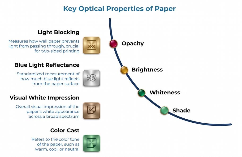
Four optical characteristics frequently appear together on paper data sheets, and buyers sometimes treat them as interchangeable. They are not. Each answers a different question about the sheet’s visual behavior.
Opacity measures how effectively the sheet blocks light from passing through. For two-sided printing, opacity is the most directly relevant property because it determines how much printed content on one side becomes visible through the reverse. A sheet with insufficient opacity will show through regardless of how bright or white it appears. Show-through itself is the visible effect the buyer is trying to control: content from the opposite side interfering with the appearance or readability of the side being viewed. Opacity is the paper property; show-through is the outcome it governs.
Brightness is a standardized optical measurement related to the reflectance of blue light from the sheet surface. A higher brightness value does not automatically mean better print quality or more accurate color reproduction. It indicates one specific dimension of the sheet’s reflective behavior.
Whiteness characterizes the overall visual impression of the sheet’s white appearance across a broader spectrum. It is related to brightness, but not identical. Two sheets with similar brightness values can look different to the eye because their whiteness profiles differ.
Shade refers to the color cast or visual tone of the sheet: warm, cool, neutral, blue-white, cream, or somewhere in between. Shade directly influences how the unprinted paper background interacts with printed colors. A warm-toned sheet will shift the perceived color of a printed image differently than a cool blue-white sheet, even if both carry similar brightness numbers.
To illustrate why these distinctions matter in practice, consider a hypothetical short-run booklet that prints substantial text and graphics on both sides. The buyer selects a visually bright, appealing sheet. After printing, reverse-side content bleeds through noticeably because the sheet’s opacity was never evaluated separately. Brightness made the unprinted sheet look impressive; opacity is what controls show-through. These are different properties requiring independent review.
For two-sided work, prioritize opacity and show-through as their own evaluation step, independent of shade or brightness preferences. For color-sensitive work, evaluate shade under the lighting conditions closest to how the final piece will be viewed.
Quick Reference: Four Optical Properties
Opacity: How effectively the sheet prevents content on one side from being visible through the other.
Brightness: A standardized measure of blue-light reflectance from the sheet surface.
Whiteness: The broader visual impression of the sheet’s white appearance across the light spectrum.
Shade: The color cast or visual tone of the sheet (warm, cool, neutral, blue-white, cream).
Match the Printed Requirement to the Property You Need to Check
The table below connects common sheetfed offset job requirements to the paper properties most relevant to each outcome and to the type of verification that helps confirm fit.
| Printed Requirement | Properties to Prioritize | What to Review |
| Fine type or small detail | Smoothness, surface uniformity, ink interaction | Data-sheet property values plus a representative printed sample showing fine elements |
| Detailed imagery | Surface character, smoothness, formation, ink holdout | Whether detail and tonal areas look consistent under production-like printing |
| Large solid areas | Formation, surface uniformity, ink interaction | Uniform appearance across the solid, not relying on category label alone |
| Two-sided pages | Opacity and show-through first, then shade and brightness as relevant | Printed reverse-side visibility under realistic ink coverage |
| Distinctive tactile appearance | Surface character, texture, shade | Whether the texture supports the intended design rather than working against it |
| Color-sensitive visual presentation | Shade, whiteness, and brightness as distinct inputs, ink-surface interaction | A production-like sample using relevant artwork and representative colors |
Keep this matrix qualitative. Each cell identifies what to examine, not a guaranteed outcome. Individual grades vary within both coated and uncoated categories, and the printed result also depends on ink, press setup, screening, and production conditions. A technical data sheet is useful evidence for comparison, but it is not a substitute for verifying the result with representative printing.
Shortlist by Evidence, Then Check a Production-Like Sample
Once the job requirements and relevant properties are clear, the selection process follows a practical sequence:
- Define the visible job requirements using the six-question checklist from the opening section.
- Identify which paper-property fields matter most for those requirements.
- Compare candidate stocks on those properties, keeping the comparison like-for-like in terms of property definition, unit, and measurement basis where applicable. Similar-looking numbers should not be compared directly if they were generated or described on different bases.
- Eliminate papers that clearly conflict with a priority job requirement. Note unresolved gaps rather than filling them with assumptions; a practical shortlist should make clear which grades have usable technical information and which properties still need clarification.
- Review physical samples to confirm surface feel, shade, and opacity under ambient light.
- For meaningful or repeat work, evaluate a production-like printed sample or controlled trial before treating the grade as proven for the application.
A blank swatch or an unprinted sheet tells part of the story. It does not show how ink will sit on the surface, how solids will look, or whether fine type will hold its intended sharpness. For jobs where the visual result matters, a printed sample under conditions that approximate the actual production run is the most reliable verification step. A successful sample provides evidence for the material and conditions represented by that evaluation, but it does not prove that every future lot or changed production condition will behave identically. Treat it as stronger evidence than an unprinted swatch or data sheet, not as an unlimited guarantee of future performance.
For further context on how broader paper specifications connect to press behavior, which paper specs matter on press extends the evaluation beyond surface and optical characteristics.
Frequently Asked Questions
Is coated paper always better for fine detail?
Not automatically. Coated surfaces often provide a smoother, more controlled printing surface that can support finer detail transfer. However, individual coated grades vary, and the actual result also depends on formation, ink interaction, press conditions, and screening. Evaluate the specific grade’s surface characteristics and a representative printed sample rather than relying on the category label as a guarantee.
Is opacity more important than brightness for two-sided printing?
They answer different questions. Opacity directly affects how much printed content shows through to the reverse side, making it the more relevant property for controlling show-through. Brightness concerns a different optical characteristic of the sheet. Both may matter to the final job, but for the specific concern of reverse-side visibility, opacity deserves its own evaluation.
Are paper brightness, whiteness, and shade the same thing?
No. Brightness measures reflectance in a specific part of the light spectrum. Whiteness characterizes the broader visual impression of the sheet’s white appearance. Shade describes the color cast or tone of the sheet. All three influence how the printed piece looks, but they are separate characteristics that should be reviewed independently when comparing candidate papers.
Conclusion
The coated or uncoated label narrows the field. It does not complete the selection. A buyer who starts with the job’s visual and functional requirements, identifies which surface and optical properties are relevant, and verifies candidates against those properties with real data and representative samples will make a more reliable choice than one who stops at the category name. The resulting evidence should increase confidence in the decision without creating false certainty; data sheets, samples, and trials support a choice within their actual scope, but they do not eliminate the effects of lot variation or changed production conditions.
Disclaimer:
This article is for general informational purposes only. It is not a substitute for advice from a qualified professional, provider, or official source relevant to your situation. Always verify important decisions with the appropriate expert, authority, or service provider.
Our Editorial Process:
Our expert team uses AI tools to help organize and structure our initial drafts. Every piece is then extensively rewritten, fact-checked, and enriched with first-hand insights and experiences by expert humans on our Insights Team to ensure accuracy and clarity.
About the PaperIndex Insights Team:
The PaperIndex Insights Team is our dedicated engine for synthesizing complex topics into clear, helpful guides. While our content is thoroughly reviewed for clarity and accuracy, it is for informational purposes and should not replace professional advice.