📌 Key Takeaways
The paper you pick for a printed bag is the print surface — and it changes how your ink, colors, and logo actually look on the finished product.
- Paper Is Your Print Surface: The shade, texture, and absorbency of the paper control how ink sits and how colors appear — not just the press setup.
- Test on the Real Paper: Digital mockups and screen previews can’t show how ink behaves on a physical sheet, so always review a printed sample on the actual production paper.
- Kraft Shifts Lighter Colors: Brown kraft paper can mute pastels and reduce contrast on fine details, but adjusting artwork before production avoids costly surprises.
- Absorbency Changes Everything: Porous paper soaks up ink deeper, which can dull colors and blur fine text — coatings or sizing may help, but add cost and change how the bag feels.
- Document What You Approve: Record the exact paper grade, shade, finish, ink method, and acceptable visual range so every production run has a shared standard to match.
Match the material to the artwork before you scale the order — not after.
Retail and food-service buyers sourcing printed paper bags will gain a clearer framework for material and print decisions here, preparing them for the detailed substrate-to-ink guidance that follows.
~ ~ ~ ~ ~ ~ ~ ~ ~ ~ ~ ~ ~ ~ ~ ~ ~ ~
When retail and food-service buyers plan a printed paper bag program, the conversation tends to start with artwork files, brand colors, and supplier pricing. Material choice usually enters as a question of strength, cost, or sustainability. What often gets overlooked is that the paper itself is the print surface, and its shade, texture, absorbency, and finish shape how ink behaves on the finished bag.
A light-colored logo may appear crisp on a white sheet but lose contrast on natural kraft. A large solid-ink area may look even on a coated surface but turn out softer on an uncoated or recycled substrate. These are material-to-print interactions that buyers can anticipate and manage before approving samples or scaling orders.
The goal is not to chase a perfect print; it is to reduce avoidable mismatches through better specification and sample review.
Paper Is the Print Surface, Not Just the Bag Material
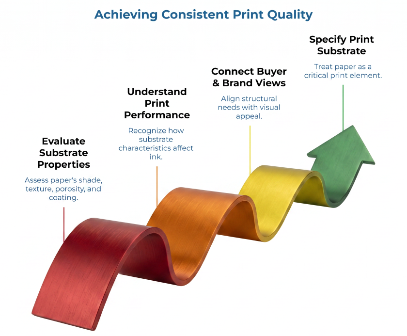
In printing, the material that receives ink is called the substrate. For printed paper bags, the substrate is the paper itself. Buyers typically evaluate bags by weight, strength, cost, and sometimes recycled content — but print performance often gets deferred to the printer or converter.
That deferral creates a gap. The substrate’s base shade, surface texture, porosity, and coating all influence how ink sits, dries, and appears. As the Flexographic Technical Association (FTA) has emphasized in its educational resources, substrate characteristics are among the key variables determining how consistently a printed image reproduces across a production run. A buyer who approves a material on weight and price alone may not discover a print issue until samples arrive — or until the bulk order is delivered.
Grams per square meter (GSM) measures mass per unit area (g/m2). While it dictates a bag’s structural tensile strength, it does not correlate with surface topology parameters. It does not, by itself, explain how smooth the surface is, how absorbent the sheet may be, how much fiber character is visible, or how the selected ink system will behave on that exact paper. A buyer may shortlist a bag material for strength, cost, availability, or sustainability positioning, while a brand team judges the same bag by logo clarity, contrast, color impression, and shelf or counter appearance. A good printed bag specification connects both views — and that connection starts with treating the paper as a print substrate.
For buyers sourcing kraft bags, the natural brown shade directly changes how every printed color is perceived. Treating paper as a print substrate means asking print-related questions before artwork approval, not after.
Material Shade and Surface Appearance: Why the Same Ink Can Look Different
The base color of the paper affects every ink color laid on top of it, making it one of the first variables buyers should evaluate for print fit.
Natural brown kraft creates a warm, earthy backdrop. Darker inks can hold strong contrast, but lighter colors like pastels and whites may appear muted or shift in tone. Fine text and detailed logos deserve close examination on kraft because the underlying shade can reduce perceived edge sharpness. The correct conclusion is not “kraft cannot print well” — the correct question is whether the artwork has been reviewed on the intended kraft substrate. For more on how shade and surface interact on kraft substrates, see this guide on customer-facing kraft packaging questions.
White or bleached paper can support stronger visual contrast and brighter color reproduction. However, “white” is not a single standard—shades vary across grades and suppliers. The actual shade, finish, and surface smoothness still need to be validated against the intended artwork. Substrate brightness and fluorescence (measured via ISO 2470) dictate final color reflectance. Consequently, uncalibrated white substrates trigger unpredictable delta-E (ΔE) color shifts in standard CMYK and Pantone matching system (PMS) inks. A comparison of natural brown vs. bleached kraft paper can help buyers understand these trade-offs.
Recycled fiber paper may show visible specks, subtle shade variation between batches, or a less uniform surface. In some brand contexts, that surface character may be desirable. In others, it may conflict with a cleaner visual system. This visual variation does not automatically disqualify recycled paper from printed applications. However, the buyer must define what visual variation is acceptable across production lots, rather than treating natural batch characteristics as downstream manufacturing defects.
For a broader comparison of kraft, white, and recycled options — including weight and strength — the PaperIndex Academy guide on paper bag material specification trade-offs covers the adjacent questions this article does not.
Ink Holdout, Absorbency, and Coatings: What Buyers Need to Understand
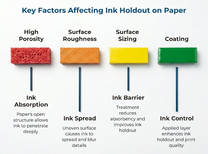
Ink holdout is the paper surface’s ability to keep ink near the top of the sheet rather than letting it absorb deep into the fiber. According to TAPPI technical resources on paper properties, ink holdout is a function of porosity, surface sizing, and coating — and it directly affects print density, sharpness, and color appearance.
High substrate porosity triggers excessive capillary absorption of the ink vehicle. This causes pigment sink, which suppresses optical density, narrows the color gamut, and induces dot gain (dot enlargement), blurring fine vector details.
Several substrate factors influence this behavior. Smoother papers tend to produce sharper printed edges and more uniform ink coverage, while rougher surfaces may create a more textured appearance — desirable for some brand aesthetics but problematic for detailed artwork. More porous papers absorb ink faster and deeper, affecting both appearance and drying behavior.
Surface roughness is a measurable technical property, not just a subjective appearance comment. Buyers do not necessarily need to specify that test method for a printed bag order, but the existence of such standards reinforces a useful point: surface properties are real material variables that affect print outcomes. Technical teams that need formal test references can start with resources such as TAPPI Standards and Methods.
Coatings and sizing treatments can reduce absorbency and improve ink holdout, often producing crisper solids and finer detail. But coating is not a universal fix. It can change hand feel, affect foldability, influence recyclability perception, and add cost.
Buyers do not need to master ink chemistry, but understanding that ink behavior is partly a material property — not solely a press-setup issue — changes the questions worth asking. When evaluating print-ready kraft paper, surface treatment and ink compatibility are practical starting points.
Substrate-to-Ink Performance Matrix
This matrix connects substrate factors to buyer questions and sample-review actions using qualitative general principles. Every combination should be confirmed through production-like samples.
| Material / Print Factor | What It May Influence | Buyer Question to Ask | What to Check in the Sample | Avoid Saying |
| Brown kraft shade | Contrast, color warmth, muted appearance on lighter inks | Has the artwork been tested on the actual kraft shade planned for production? | Logo contrast, light color visibility, small-type legibility | “Kraft cannot print well.” |
| White / bleached paper | Contrast, color brightness, visual crispness | Is this the final paper grade and finish, or a generic stand-in? | Solid ink areas, scuffing resistance, shade consistency across sheets | “White guarantees accurate brand color.” |
| Recycled fiber content | Shade variation, surface uniformity, batch-to-batch consistency | What level of visual variation is normal for this recycled grade across production lots? | Specks, shade drift between sheets, print consistency across the run | “Recycled paper is always inconsistent.” |
| Surface roughness | Edge sharpness, coverage uniformity, detail reproduction | Is the surface suitable for the level of artwork detail required? | Fine text clarity, line sharpness, registration accuracy | “Texture is only an aesthetic choice.” |
| Absorbency / ink holdout | Ink density, color saturation, sharpness, drying behavior | Has the specific ink-and-paper combination been tested together? | Large solid areas, fine detail, rub and scuff resistance | “Ink behavior is only the printer’s responsibility.” |
| Coating or sizing | Ink holdout, surface finish, gloss or matte appearance | What coating or sizing is applied, and how does it affect ink behavior and bag handling? | Gloss or matte appearance, handling marks, fold-crack resistance | “Coated paper is always the best option.” |
| Heavy coverage artwork | Ink demand, drying time, scuffing risk | Can the paper and ink system support the coverage area without scuffing or set-off? | Solid areas under handling, rub test results, ink density uniformity | “Any paper handles heavy coverage.” |
| Fine text or detailed logo | Edge sharpness, legibility, registration precision | Which artwork elements are most sensitive to this substrate? | Small type at actual size, thin lines, logo detail under magnification | “Fine detail prints the same on every paper.” |
| Food-service context | Compliance for inks, coatings, liners, and contact surfaces | Do inks, liners, coatings, adhesives, and contact surfaces need separate compliance documentation? | Documentation completeness, not just visual appearance | “All food-grade bags are print-safe.” |
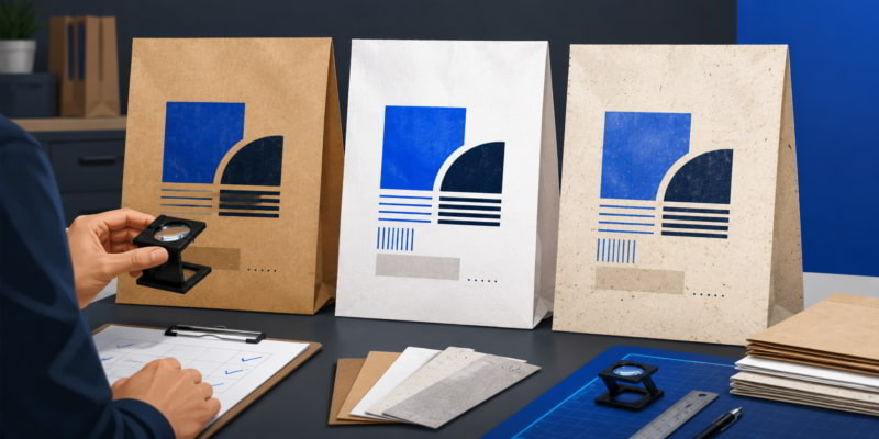
How to Review Printed Bag Samples Before Approving Production
Digital artwork files and on-screen mockups are useful starting points, but they are incomplete — they do not show how ink interacts with a physical paper surface. A design that looks vibrant on a monitor may appear warmer, softer, or less saturated on the actual bag.
Physical press proofs provide the only reliable baseline for evaluating ink performance. These evaluation samples must utilize the exact paper grade, basis weight, base shade, chemistry, and flexographic or digital press settings intended for the commercial run. Using a non-production substrate or an analog proofing method (like a hand-drawn K-proofer) to approximate a high-speed flexographic run invalidates the proof. It fails to account for dynamic ink transfer, shear thinning under pressure, and ink-drying kinetics.
When reviewing samples, check large solid ink areas for uniformity; examine fine text and logos for sharpness; compare base shade across multiple sheets; and handle the bag as a customer would to see whether print holds up under use. Review conditions matter as well — a bag may look different under office lighting, store lighting, warehouse lighting, or café counter lighting. Substrates also experience mechanical degradation; surface appearance can shift radically following high-density stacking, structural folding, frictional handling, or transport stress.
Establish objective tolerance thresholds using a spectrophotometer to lock in an acceptable Delta-E (ΔE ≤ 2.0) variance ceiling across production runs. A simple approval record can reduce confusion later: document the approved substrate, artwork version, paper shade, finish, coating or sizing, print method, sample date, acceptable visual variation, and any sensitive artwork elements such as light colors, fine type, large solids, or detailed logos.
Questions to Ask Suppliers and Printers Before Choosing Material
Prepared buyers enter supplier and printer discussions with specific questions. The list below translates the material and print considerations above into procurement steps:
- Is the sample printed on the same paper grade, finish, and shade planned for the production order?
- What surface treatment, coating, or sizing is used on this paper, and how does it affect ink holdout?
- Are there expected shade or surface variations across production lots for this material?
- Can the supplier provide a production-like printed sample before the buyer commits to a full order?
- Which artwork elements — fine text, light colors, large solids, gradients — are most sensitive to this substrate?
- What specification tolerances or approval criteria should be documented before production begins?
- For food-service bags, do the inks, coatings, liners, adhesives, and contact surfaces require separate compliance documentation for the intended market and use case?
Official resources such as the FDA’s page on Packaging & Food Contact Substances and the European Commission’s page on Food Contact Materials can help teams understand why food-contact claims need jurisdiction- and use-case-specific review. For contact-surface and liner considerations specific to paper bags, see this article on food-service paper bag materials.
When to Choose Kraft, White, Recycled, or Coated Material for Brand Presentation
There is no universally “best” material for printed paper bags. The right choice depends on visual goals, artwork requirements, functional demands, and acceptable batch-to-batch variation.
Kraft can support a natural or artisanal brand feel. Validate how fine details and lighter colors perform on the actual shade before approving artwork.
White or bleached paper can support high contrast and brighter color reproduction. Confirm the specific grade’s shade and finish — not all white papers deliver the same result.
Recycled paper can support sustainability-oriented brand presentation. Define the acceptable range of surface variation so that batch-to-batch differences do not trigger unnecessary rejection.
Coated or treated paper can improve ink holdout and surface uniformity for certain print goals, but may also affect cost, hand feel, foldability, and how the bag is perceived by environmentally conscious customers.
Hypothetical example: a café chain wants a printed kraft takeaway bag with a light-colored logo. The supplier’s digital mockup looks strong, but the buyer requests a production-like sample on the actual kraft paper. The sample reveals lower contrast than expected — so the buyer adjusts artwork before scaling the order, avoiding a bulk run that would have disappointed brand stakeholders.
Conclusion: Material Selection Governs Print Integrity
Material choice shapes print presentation. Buyers who treat paper as a passive commodity may discover print issues too late. Buyers who treat it as a print substrate — and review it accordingly — can reduce surprises and give suppliers clearer documentation to work from.
Before approving a printed bag order, document the material, artwork, print method, and sample-review criteria your supplier should confirm. That record gives procurement, brand, operations, suppliers, and printers a shared basis for approval — and a reference point if the production run does not match the approved sample.
Explore paper bag suppliers or browse kraft paper bag suppliers after preparing your print-related questions.
Frequently Asked Questions
Does kraft paper affect printed colors?
Yes. The natural brown base shade can influence how ink colors appear — especially lighter tones and fine detail. Buyers should test actual artwork on the intended kraft paper rather than relying on digital mockups. The effect varies by shade, ink type, and artwork complexity, so production-like sample review is the most reliable assessment method.
Is white paper always better for printed paper bags?
No. White paper may support stronger contrast for some artwork, but the specific grade, surface finish, coating, and ink system still affect results. A white paper with a rough surface or high absorbency can still produce unexpected print behavior. Sample validation applies regardless of base color.
Should food-service buyers ask different questions about printed paper bags?
Yes. When inks, coatings, liners, adhesives, or surfaces may contact food, buyers should request compliance documentation for their specific use case and jurisdiction. Generic “food safe” claims are not a substitute for verified documentation. See the PaperIndex Academy guide on food-service paper bag materials for more detail.
Disclaimer:
This article is for general informational purposes only. It is not a substitute for advice from a qualified packaging, printing, compliance, or technical professional familiar with your specific product, market, and use case. Always verify important material, print, safety, and compliance decisions with the appropriate supplier, printer, authority, or expert.
Our Editorial Process:
Our expert team uses AI tools to help organize and structure our initial drafts. Every piece is then extensively rewritten, fact-checked, and enriched with first-hand insights and experiences by expert humans on our Insights Team to ensure accuracy and clarity.
About the PaperIndex Insights Team:
The PaperIndex Insights Team is our dedicated engine for synthesizing complex topics into clear, helpful guides. While our content is thoroughly reviewed for clarity and accuracy, it is for informational purposes and should not replace professional advice.