📌 Key Takeaways
Kraft paper for branded packaging needs print, surface, and shade testing — not just weight and price checks.
- Start With the Customer’s View: Choose your paper grade based on how and where the customer will see, touch, or photograph the packaging — not just internal specs.
- Match Paper to Print Method: Confirm the ink system and printing process before picking a grade, because brown kraft changes how every colour looks on the final product.
- Surface Finish Drives Print Quality: Roughness, smoothness, and porosity directly affect ink sharpness, colour strength, and whether your logo looks crisp or muddy.
- Shade Drifts Between Orders: Natural and recycled kraft can shift in tone batch to batch, so define acceptable colour variation and tie approved samples to your purchase order.
- Test Before You Commit: Request printed proofs on the actual production grade, run converting trials, and document the full specification before placing a bulk order.
The cheapest quality control happens before the purchase order — not after the first customer complaint.
Procurement managers, packaging buyers, and brand owners sourcing kraft paper for customer-facing applications will find a ready-made supplier question list below, preparing them for the detailed overview that follows.
~ ~ ~ ~ ~ ~ ~ ~ ~ ~ ~ ~ ~ ~ ~ ~ ~ ~
Kraft paper gets bought like a commodity.
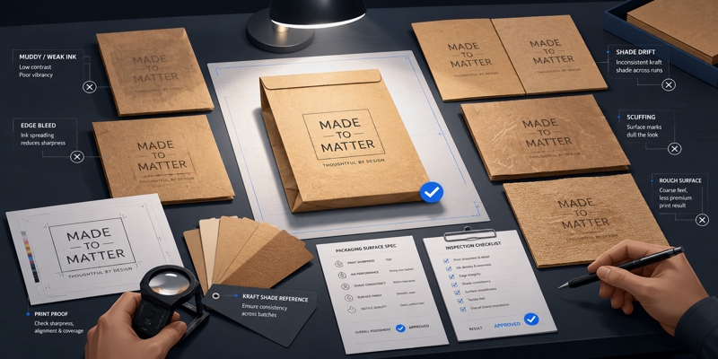
The procurement team checks GSM, compares prices, confirms the delivery window — and signs off. Then the printed bags arrive, and the logo looks like it was pressed through a damp cloth. The green is muddy. The edges bleed. The surface reads as cheap once the bag is folded, filled, and photographed by a customer.
You have probably seen some version of this. The mockup looked sharp on screen, but the printed result came back dull. The design team expected crisp fine lines, and the substrate could not reproduce them. The first batch was acceptable, but the reorder shifted in shade and nobody caught it until customers started commenting. These are not random quality failures. They are the predictable result of choosing kraft paper without asking the right questions early enough.
The questions below close that gap — before the purchase order, not after the complaint. Work through them, and you will walk into supplier conversations prepared to talk about surface quality, print compatibility, shade consistency, and finishing, not just weight and price.
Where Will the Customer See or Touch This Packaging?
Effective grade selection begins at the final point of interaction—where the consumer evaluates the brand through the packaging.
A kraft wrap used for internal protection has almost no visual expectation. A branded retail bag on a shelf under fluorescent light, a subscription mailer arriving after three days in a courier van, a takeaway bag handed across a counter, a gift sleeve unboxed on camera — each scenario places different demands on surface smoothness, shade consistency, scuff resistance, and print clarity. Some packaging is seen briefly and discarded. Other packaging becomes part of the brand experience, kept, reused, or shared on social media.
A small skincare brand using kraft mailers may care less about ultra-sharp fine print than about a consistent shade, clean logo reproduction, and a surface that does not look dirty or scuffed when photographed. A converter making branded retail bags may need stronger attention to folding, rub resistance, ink coverage, and machineability. If the paper will be visible to the customer, treat it as a brand surface, not just a packaging input.
Establish performance benchmarks for ‘tactile quality’ based on consumer touchpoints before evaluating technical specifications. For related sourcing context, buyers can review PaperIndex listings for kraft paper jumbo roll suppliers, kraft paper producers, and kraft paper bags.
What Print Method and Ink System Will Be Used — and Does the Grade Support Them?
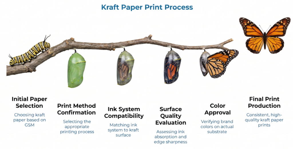
Confirm the print process before approving the paper grade. Print quality is not only about the printer. The kraft paper surface directly affects ink absorption, edge sharpness, colour strength, drying time, mottle, rub resistance, and fine-detail reproduction. Choosing the grade before confirming the print method and ink system is a common and expensive sequence error — one that mirrors the broader pattern of buying kraft paper on GSM alone without evaluating the properties that actually affect converting and end-use performance.
Flexographic printing, offset printing, screen printing, and digital printing each place different demands on the substrate. Water-based, solvent-based, and UV-curable ink systems interact differently with kraft surfaces. Fine text, QR codes, thin lines, and detailed logos require more controlled surface quality than a single-colour stamp. Brown kraft also changes how every colour appears — inks can look darker, warmer, or duller than expected because the substrate is not white.
For example, a muted green logo that appears vibrant on a digital monitor will often lose saturation on unbleached fibers; this is a failure of substrate-ink compatibility testing, not necessarily a mechanical printing error.
Before ordering, consider how brown kraft will affect the selected brand colours, whether the ink coverage requires drying, rub, or scuff testing, and whether the printer can produce a proof on the actual production grade. Color approval must be tied to physical proofs. Ensure the designer evaluates samples produced on the target substrate using the specific ink chemistry and press type intended for the final run. For buyers specifying visual characteristics or print process parameters formally, ISO 12647-1 defines process-control parameters used to specify visual characteristics and related technical properties of production prints and simulations. Where flexographic printing is involved, the Flexographic Technical Association’s FIRST guidelines provide direction for consistent reproduction across the packaging supply chain.
How Smooth, Rough, or Coated Is the Surface?
Surface quality is where many kraft paper decisions fail. The answer to whether a grade supports the intended print clarity and finish sits at the intersection of appearance, print performance, and converting behaviour.
A rougher kraft surface supports a natural, rustic feel — and that may suit a bakery sleeve, handmade product wrap, or organic-style insert. The same roughness can work against small type, fine linework, dense ink coverage, and crisp logo reproduction. A smoother or treated surface supports sharper graphics and cleaner brand presentation. Coated or surface-treated options may improve ink holdout and reduce mottle, but they can also affect feel, recyclability claims, cost, and converting behaviour. Buyers should ask whether the paper is machine-finished, calendered, coated, uncoated, or treated for print performance.
Porosity matters alongside roughness. A more absorbent or open surface may pull ink into the sheet differently than a tighter, smoother surface. That can affect colour strength, drying behaviour, and mottle — and for mailers or wrapping applications, Cobb value bands offer a practical way to set measurable printability and adhesion thresholds. Exact behaviour varies by grade, ink system, and printing process, so porosity should be tested rather than assumed.
Surface quality is not purely subjective. Roughness and smoothness can be measured using standardized methods. ISO 8791-2 specifies a Bendtsen method for determining paper and board roughness. Smithers notes that surface properties can be assessed through air leakage and profilometry testing, and Fogra provides printability-related testing references including mottling tendency and optical properties.
Key buyer questions: Is this grade recommended for printed consumer-facing materials? What roughness or smoothness range does the supplier specify? Is the surface consistent across lots? Is a coated or smoother alternative available? Will the surface pick, fuzz, or absorb ink unevenly? Request the supplier’s technical data sheet to verify with actual numbers.
Will the Shade and Appearance Stay Consistent Across Orders?
The first batch looks right. The reorder, three months later, arrives a shade darker, with a different fiber appearance and faint specks that were not visible on the original sample. The black logo still prints well — but lined up on a shelf, the product family looks inconsistent.
This is a common commercial complaint, and it affects any business building visual coherence across a product range. A candle brand using kraft labels across multiple fragrance lines, for instance, may not notice shade drift on a single order. The problem surfaces when the full line sits together and the packaging no longer matches.
Natural brown kraft and unbleached kraft can vary in tone from batch to batch. Recycled kraft may show more visible variation in shade, fiber appearance, and surface cleanliness, depending on source material and grade — a trade-off explored in detail in choosing between recycled and virgin kraft paper for bag durability. This does not make recycled kraft inherently lower quality — but it does mean that recycled content and natural fiber variation may require tighter sample approval and expectation-setting. Where strict color control matters, white or bleached kraft may be preferable.
Buyers should define acceptable variation before placing repeat orders, using colour measurement references or internal quality standards where possible. The sample approval process should include the exact grade, finish, supplier, and intended print process. Some variation is part of kraft paper’s appeal — but branded outer-packaging needs controlled variation that matches the brand promise.
A purchase order specifying only ‘brown kraft paper’ leaves too much room for drift. It should identify the grade, GSM, caliper where relevant, finish, shade reference, approved sample, and any production tolerance that matters to the final package — following the discipline of a spec-driven RFQ that forces comparable, measurable responses from every supplier.
Will the Paper Survive Converting, Handling, and Final Use?
A flat sheet can look flawless and still fail once converted. The surface that appeared clean and printable as a swatch may behave differently after folding, creasing, gluing, die-cutting, packing, and shipping. This is where machineability enters the conversation — and where grade selection that happened too late in the design process creates avoidable problems for converters.
The practical concerns span the full workflow: folding and cracking, scuffing or rubbing during packing, glue adhesion, creasing behaviour, die-cutting edge quality, lamination or varnish compatibility, and moisture exposure during transit. Customers do not diagnose these issues technically. They just see packaging that looks worn, dirty, faded, or cheap — and they draw conclusions about the product inside.
Before committing to a grade, ask whether it has been used for this packaging format before. Can it be tested through the actual converting line? A structured supplier trial with baseline data and acceptance criteria answers both questions before production volumes are committed. Does the print rub off under normal handling? Does the paper crack at folds? Will the surface hold up in transit? ASTM International maintains standards for testing physical, mechanical, and chemical properties of paper and paperboard used in packaging. For a deeper look at how kraft paper grade selection affects converting performance, technical documentation provides the necessary failure-mode analysis for high-speed converting.
What Must Be Verified Before Committing to a Bulk Order?
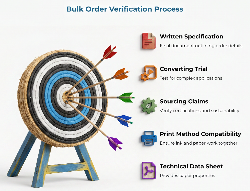
Treat verification as a quality control step, not paperwork. This is the most actionable part of the buying process — and the one most often skipped.
A practical pre-purchase verification should cover: a plain paper sample; a printed sample using actual artwork on the intended production grade (not a display sample from a different stock); the supplier’s technical data sheet with GSM, caliper, surface finish or smoothness, and shade reference; confirmed print method compatibility; coating or treatment details; any recycled, virgin, or FSC chain-of-custody certified sourcing claims verified against certification bodies; minimum order quantity and reorder consistency expectations; a converting trial if the application is complex; and a written specification on the purchase order.
Do not approve based only on a photograph, PDF mockup, or generic swatch. Tie the approved sample to the production specification in writing. For complex applications, a documented supplier trial with baseline data and acceptance criteria prevents more disputes than any contract clause.
Yes, a higher-grade or better-specified paper may increase cost. The relevant question is whether better surface consistency, print clarity, or finish reduces complaints, rework, rejected batches, or brand damage enough to justify the difference. This is a strategic procurement calculation: weighting the upfront material cost against the long-term risk of brand erosion or batch rejection. In many customer-facing applications, the answer is yes.
Questions to Take to Your Supplier or Converter
Before the next purchasing conversation, work through this list:
- Which kraft paper grades do you recommend for customer-facing printed packaging?
- Is this grade better suited for a rustic look, premium print, or general-purpose packaging?
- What print methods and ink systems has this grade successfully supported?
- Can you provide printed samples using similar artwork and ink coverage?
- How consistent is the shade across lots and reorders?
- What surface finish, coating, porosity, or smoothness data is available on the technical data sheet?
- Will this grade work with folding, gluing, die-cutting, or other converting steps?
- What defects or appearance variations are considered within production tolerance?
- Can the approved sample be tied to the production specification?
- What should be tested before ordering at full volume?
For a broader specification workflow, see our guide on defining and enforcing kraft paper technical specs and the accompanying spec-driven kraft paper RFQ template.
These questions are not adversarial. They are the kind of detail-level conversation that separates a smooth production run from a costly surprise — and they naturally support better communication between buyers, kraft paper sellers, printers, and converters.
Choose for the Customer’s Eye, Not Just the Spec Sheet
Kraft paper selection should start with the final presentation, not catalog defaults. GSM and price matter, but they do not guarantee brand-ready packaging. The best buying process aligns paper grade, surface quality, print method, design expectations, and final use before production — not after the first complaint.
Request physical samples. Insist on printed proofs. Document the specification. The time invested before the purchase order is the cheapest quality control available.
Frequently Asked Questions
What is the most important question to ask before buying kraft paper for packaging?
Ask how the paper will perform in the final customer-facing application — considering print method, surface finish, shade consistency, converting requirements, and how the customer will see or handle the packaging.
Is higher GSM kraft paper always better for branded packaging?
No. GSM indicates weight, not print suitability, shade consistency, surface smoothness, or premium appearance. A lower or mid-weight grade with the right surface properties may outperform a heavier sheet for printed kraft paper packaging.
Why does printing look different on brown kraft paper?
Brown kraft changes how ink colours appear because the substrate is not white. Colours may look darker, warmer, duller, or less vibrant. Request printed samples on the actual grade before approving artwork.
Is kraft paper supposed to look imperfect?
Some variation is part of kraft paper’s appeal. The issue is control. Primary retail packaging can look natural and still maintain consistent shade, surface cleanliness, and print quality across production runs. Uncontrolled variation is what makes packaging look faded, dirty, or mismatched.
Should coated or uncoated kraft paper be used?
It depends on the intended look, print method, budget, and sustainability requirements. Coated or treated surfaces may support sharper print and better ink holdout, while uncoated kraft provides a more natural feel. Test both against the final packaging goal.
How can appearance complaints from customers be reduced?
Define the desired appearance early, test the paper with actual print and converting steps, approve physical samples, confirm acceptable variation tolerances, and document the final grade and specification before committing to a bulk order.
Disclaimer:
This article is for a general commercial packaging audience and does not address regulated food-contact, medical, or export-compliance requirements. Specific performance benchmarks, tolerances, test values, and compliance requirements should be verified with suppliers, converters, or relevant standards bodies.
Our Editorial Process:
Our expert team uses AI tools to help organize and structure our initial drafts. Every piece is then extensively rewritten, fact-checked, and enriched with first-hand insights and experiences by expert humans on our Insights Team to ensure accuracy and clarity.
About the PaperIndex Insights Team:
The PaperIndex Insights Team is our dedicated engine for synthesizing complex topics into clear, helpful guides. While our content is thoroughly reviewed for clarity and accuracy, it is for informational purposes and should not replace professional advice.