📌 Key Takeaways
Choosing between natural brown and bleached kraft paper is a print and brand decision, not just a color preference.
- Start With the Job, Not the Shade: Define the print method, brand look, and end use before picking a kraft paper color to avoid costly reprints.
- Brown Kraft Suits Bold, Simple Designs: Natural brown works best with dark inks and minimal graphics where the paper texture is part of the brand story.
- Bleached Kraft Wins on Print Clarity: A white or near-white base gives sharper contrast for small text, barcodes, brand colors, and detailed artwork.
- Always Proof on the Actual Paper: Colors approved on a white screen will shift on a brown sheet—request a printed sample on the target substrate before sign-off.
- Brown Doesn’t Automatically Mean Green: A natural look suggests sustainability, but real claims need fiber sourcing, certifications, or recycled content data to back them up.
The right kraft paper grade matches the application, artwork, and customer expectation—not just the color on the swatch.
Kraft paper converters and packaging procurement teams will gain a clearer framework for guiding customer shade decisions early, preparing them for the detailed comparison that follows.
~ ~ ~ ~ ~ ~ ~ ~ ~ ~ ~ ~ ~ ~ ~ ~ ~ ~
A customer picks natural brown kraft for a “premium sustainable” mailer. The artwork features a white logo, fine tagline text, and pastel accents. Three weeks later, the printed sample lands on the desk—and the logo looks muddy, the tagline vanishes into the brown base, and the pastels have shifted into colors nobody approved. That’s not what we designed.
Or the reverse: a customer chooses bleached kraft for a clean retail bag. The print comes back sharp. But the customer holds it next to a competitor’s earthy, textured packaging and says it doesn’t feel natural enough for their brand.
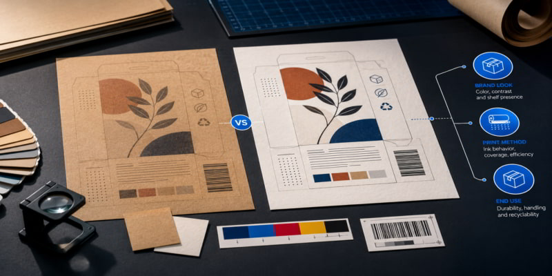
Both problems share one root cause—the shade conversation happened too late. Natural brown vs. bleached kraft paper isn’t a color preference. It’s a decision about print outcome, shelf appearance, brand positioning, surface requirements, and end-use fit, and it should be settled before artwork approval, sampling, and quoting begin.
The better starting question isn’t “Which color do you want?” It’s this: What does the package need to communicate, how will it be printed, and where will the customer see or use it?
Start With the Application, Not the Shade
Before discussing shade or finish, identify the application environment and the customer-facing role of the material. Is the paper mainly functional, decorative, protective, printable, or brand-facing? Will it be used for bags, wraps, liners, labels, mailers, food packaging, retail packaging, ecommerce packaging, or industrial packaging? Will the surface carry brand colors, safety information, barcodes, or premium graphics? And will the customer judge the paper by shelf appearance, tactile feel, print clarity, or perceived sustainability?
These questions shape kraft paper grade selection far more than shade alone. For bag manufacturing, the same application-first logic applies to choosing the right kraft paper grade for bag manufacturing—the paper should match the job, not just the label.
A natural brown kraft wrap may support a rustic, minimal, organic look perfectly. But that same material won’t deliver if the customer expects bright brand colors, photographic detail, or fine reverse-out text. Starting with GSM, price, or stock availability before confirming visual and functional needs increases the risk of misalignment at every step that follows—a pattern explored in detail in Beyond GSM: jumbo roll buying criteria that prevent breaks, waste, and downtime.
Natural Brown Kraft: Where It Fits Best
Natural brown kraft is a strong fit when the desired presentation is earthy, utilitarian, understated, craft-oriented, or sustainability-coded. It works well for minimalist single-color printing, especially with dark inks and bold graphics. Brands that want the natural fiber texture and raw paper appearance to remain visible often choose natural brown deliberately—the substrate becomes part of the design language rather than a neutral backdrop.
Common applications include ecommerce mailers, shopping bags, and wraps. For food-contact uses, ensure the grade meets FDA standards (e.g., 21 CFR 176.170 for aqueous and fatty foods; 21 CFR 176.180 for dry foods) and follow EuPIA guidelines for ink safety. Rustic, handmade, organic, or artisanal brand positioning pairs naturally with the unbleached surface.
Natural brown kraft can be a branding asset when the substrate color is part of the design—not when the customer expects it to behave like a neutral white background.
Here’s the tradeoff. The brown base affects print contrast directly. Light colors, subtle gradients, fine detail, and small text lose impact unless artwork, ink system, opacity, and surface finish are planned around the substrate shade. A logo designed on a white screen won’t reproduce the same way on a brown sheet. If the customer’s palette relies on pastels, whites, or tightly controlled color matching, natural brown kraft demands testing on the actual substrate before commitment—not on a monitor.
One more point needs careful handling: brown does not automatically mean sustainable. A natural look can communicate sustainability, but the claim should be supported by fiber sourcing, recycled content, chain-of-custody certification, recyclability data, or supplier documentation.
Bleached Kraft: Where It Fits Best
Bleached kraft is often chosen when the paper needs to step back and let graphics, contrast, and brand color do more of the work. It provides a cleaner, brighter, more controlled visual base for printing and brand presentation.
The practical advantages are straightforward: higher contrast printing, cleaner retail shelf presentation, and more predictable color reproduction—meaning less variation between the approved proof and the final printed package. For applications where readability matters—instructions, ingredients, QR codes, barcodes, compliance text, or small brand elements—a bleached base often makes the difference between legible and lost.
Bleached kraft also fits when the customer’s mental reference point is closer to white paper or coated board than to natural kraft. Premium, hygienic, or polished packaging presentations lean this direction, as do applications where brand colors, small typography, icons, detailed graphics, or photographic elements must reproduce cleanly.
A cream or off-white base may sometimes offer a middle ground for customers who want a softer warmth without the full visual shift of natural brown, though the final choice still depends on supplier specifications, artwork, print method, finish, and approval samples.
The tradeoff runs the other way. Bleached kraft may conflict with brands trying to communicate a natural, recycled, handmade, or low-intervention identity. Don’t imply that bleached equals premium or that brown equals basic—each serves a different visual and functional purpose, and the right choice depends entirely on the application and customer expectation.
Print Contrast and Surface Requirements: The Decision Point Converters Often Miss
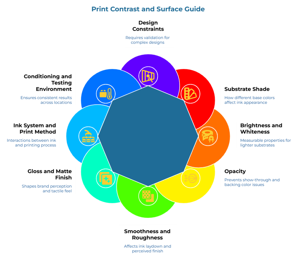
Print outcome depends on more than the choice between natural brown and bleached. Surface characteristics play a decisive role, and converters who address them early—before artwork sign-off—prevent the kind of surprises that lead to reprints.
Substrate shade: Brown, cream, white, and off-white bases each change how inks appear. A four-color process designed for a white base will shift noticeably on a natural brown sheet, and most customers won’t anticipate that shift unless someone tells them.
Brightness and whiteness: These are measurable properties most relevant when evaluating lighter substrates. TAPPI T 452 covers brightness determination for white, near-white, and naturally colored pulp, paper, and paperboard, while ISO 2470-1 applies specifically to white and near-white substrates. For natural brown kraft, brightness values are typically lower and less useful as a selection tool—surface shade and ink contrast matter more. Specific brightness values should come from the supplier’s data sheets or test reports rather than from general assumptions.
Opacity: This is important when show-through, backing color, or double-sided printing matters. ISO 2471 describes a method for determining paper and board opacity by diffuse reflectance; verify the applicable method for your specific product context with your supplier.
Smoothness and roughness: These affect ink laydown, sharpness, coating needs, and perceived finish. A rougher surface may suit a tactile, handmade presentation. A smoother surface supports finer detail and tighter print registration.
Gloss and matte finish: The surface finish affects how premium, natural, or technical the package feels to the customer. A high-gloss finish signals polish; a matte or uncoated finish signals authenticity. The choice shapes brand perception before the customer reads a single word of print.
Ink system and print method: Flexographic, offset, digital, and screen printing each interact differently with the substrate. ISO 12647-6 addresses flexographic process control for packaging, and the FTA FIRST guidelines help converters translate customer graphic requirements into printable specifications. The artwork complexity and the print method should be discussed together, not sequentially.
Conditioning and testing environment: Paper properties respond to humidity and temperature, which matters when teams compare samples or evaluate test results across different locations. ASTM D685 defines standard atmospheres for conditioning and testing paper and paper products—a standard requirement when printed drawdowns or physical comparisons are part of the approval workflow.
Design constraints: Low-contrast palettes, fine serifs, and photographic gradients require substrate-specific validation; the unbleached base acts as a filter that desaturates these elements. When the artwork pushes into any of these areas, a printed drawdown on the target substrate isn’t optional—it’s the only way to confirm the design will hold.
Before recommending a grade, confirm these six points with the customer:
- Will they print one color, multiple colors, white ink, or full graphics?
- Are brand colors critical or approximate?
- Are barcodes, QR codes, or small text required?
- Is the desired look rustic, premium, clean, natural, technical, or retail-polished?
- Will the substrate itself be part of the brand story?
- Is a printed proof or drawdown required before approval?
If you’re building technical specifications for kraft paper converting, surface and print requirements belong in the spec document from day one—not as an afterthought once production has started. And if printability, sealing, or absorbency is also part of the discussion, consulting established material testing resources—such as Cobb value, printability, and adhesion for mailers and wraps—can help teams think beyond shade and into surface behavior.
Application Fit: A Practical Comparison
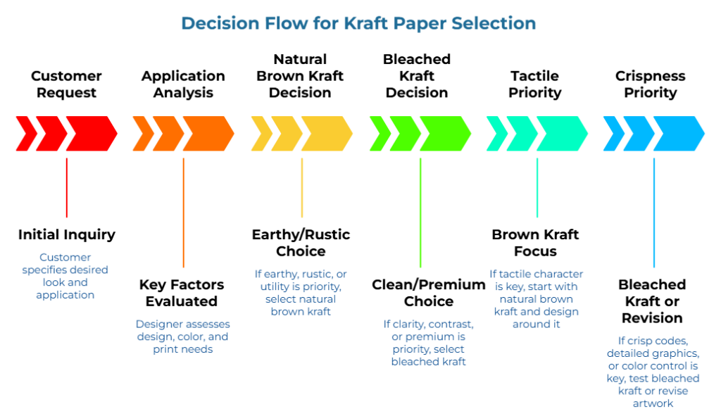
Natural brown kraft is usually worth considering when the customer wants an earthy, natural, rustic, or utility-forward look; the design uses dark inks, bold typography, simple logos, or limited color; the substrate color is intentionally part of the brand presentation; and the application doesn’t depend on highly precise color reproduction.
Bleached kraft is usually worth considering when the customer wants cleaner, brighter, or more premium presentation; print clarity and contrast matter more than a natural-paper aesthetic; the artwork includes brand colors, small type, icons, QR codes, or detailed graphics; and the customer expects the finished package to resemble a white or light print base.
If the priority is tactile brand character, start with natural brown kraft and design around the brown base. If the priority is crisp codes, detailed graphics, small typography, or closer color control, test bleached kraft or revise the artwork before quote lock.
Grade selection still depends on basis weight, finish, coating, strength requirements, converting process, food-contact compliance, and supplier specifications. The comparison above addresses visual and print fit—not the full procurement picture. For a deeper look at matching properties to applications, the kraft paper property-application match matrix provides a useful starting point. For supplier approval workflows beyond visual sampling, utilizing structured qualification frameworks—such as standardizing supplier trials before approving parent rolls—provides a useful next layer.
How Converters Can Guide the Customer Conversation
Converters sometimes hesitate to push back on a customer’s initial shade preference—it can feel overly technical, or worse, dismissive of what the customer wants. But the right questions don’t challenge the preference. They protect it.
- Ask about the visual goal: “Should the package look natural and tactile, or clean and print-forward?”
- Ask about the artwork: “Are there light colors, small text, barcodes, QR codes, or brand colors that need to match closely?”
- Ask about the approval process: “Will you approve a physical sample on the actual substrate, or only digital artwork?”
- Ask about the application: “Will this be seen on a retail shelf, shipped in ecommerce, handled in food service, or used as protective packaging?”
- Ask about constraints: “Are price, lead time, compliance, sustainability documentation, or print consistency the main decision drivers?”
If the customer uses the term ‘kraft’ loosely, ask them to prioritize: is the priority aesthetic (the brown look), tactile (the paper feel), or functional (printability and compliance)? For wrapping-specific applications, a dedicated kraft paper grade selection guide for wrapping paper conversion can help narrow the conversation further.
A sales-support rep can frame the recommendation clearly: “For a natural, minimal look with dark one-color printing, natural brown kraft supports the brand story well. For sharper contrast, readable codes, and stronger color control, we’d want to test bleached kraft or adjust the artwork before quoting.”
That conversation takes 90 seconds. It can prevent weeks of rework.
Common Mistakes and Objections
Treating natural brown and bleached kraft as purely aesthetic choices. Appearance drives print behavior, code readability, and brand perception. For brand packaging, appearance is a functional requirement—not a superficial one.
Approving artwork digitally without substrate-specific proofing. Colors on a white screen don’t predict colors on a brown sheet. Request a drawdown or printed sample on the target substrate before final approval.
Assuming brown kraft always means sustainable. A natural look can communicate sustainability, but the claim should be supported by fiber sourcing, recycled content, chain-of-custody certification, recyclability data, or supplier documentation.
Assuming bleached kraft always means premium. Premium perception depends on the total presentation—finish, print quality, structural design—not shade alone.
Discussing surface finish only after the customer complains about print quality. Surface and finish conversations belong at the quoting stage, not the complaint stage.
Ignoring QR codes, barcodes, fine print, and light ink colors. These are often the first elements to fail on a mismatched substrate. Test them early.
Recommending based on available stock before understanding the brand requirement. A fast quote on the wrong grade—one that leads to a reprint—costs more than a slower, accurate quote.
Similarly, requests for white ink on brown substrates require early confirmation of ink opacity, cost, and specific proofing.
For food-contact applications, do not rely on appearance or grade name alone. In the U.S., eCFR sections 21 CFR 176.170 and 176.180 address components of paper and paperboard in contact with aqueous, fatty, and dry foods—and converters should be aware that brown kraft paper does not automatically mean FDA compliant. Printed food-contact packaging may also require ink and coating review; EuPIA’s GMP guidance addresses inks, varnishes, and coatings for food-contact materials.
Frequently Asked Questions
Is natural brown kraft paper better than bleached kraft paper?
Neither is inherently better. The right choice depends on the application, brand goal, print design, and customer expectations. Natural brown kraft supports a rustic or natural look. Bleached kraft offers a cleaner base for contrast and graphics.
Which kraft paper is better for printing?
Bleached kraft often performs better when strong contrast, color clarity, small text, or detailed graphics are important. Natural brown kraft works well for bold, simple, dark-ink designs where the brown base is part of the visual identity.
Does brown kraft paper always mean sustainable packaging?
No. While unbleached fibers often carry a ‘green’ halo, true sustainability is verified through life cycle assessments (LCA), FSC/PEFC certifications, and post-consumer waste (PCW) percentages.
What should converters confirm before recommending a kraft paper grade?
Confirm the application, desired brand look, print method, artwork complexity, surface finish, compliance requirements, physical performance needs, and whether the customer will approve physical samples on the actual substrate.
The customer from the opening scenario—the one holding a muddy print sample—needed a different conversation before artwork approval, not a different paper after the fact. Natural brown vs. bleached kraft paper should be chosen based on the final customer experience, not material color alone. Converters who bring print, surface, and brand questions into the earliest packaging substrate selection conversation don’t just make better recommendations. They prevent the rework, quote revisions, and disappointment that come from getting it right too late.
A good recommendation isn’t “brown or bleached.” It’s the grade that best matches the application, the artwork, and the customer expectation.
When you’re ready to source brown paper jumbo rolls or connect with verified kraft paper producers globally, PaperIndex provides free access to suppliers across 195 countries.
Disclaimer:
The information provided here is for general educational and informational purposes. Specific paper grade performance, food-contact suitability, print outcomes, and certification claims should be verified against supplier data sheets, test reports, and applicable regulatory or standards documentation before making procurement or production decisions.
Our Editorial Process:
Our expert team uses AI tools to help organize and structure our initial drafts. Every piece is then extensively rewritten, fact-checked, and enriched with first-hand insights and experiences by expert humans on our Insights Team to ensure accuracy and clarity.
About the PaperIndex Insights Team:
The PaperIndex Insights Team is our dedicated engine for synthesizing complex topics into clear, helpful guides. While our content is thoroughly reviewed for clarity and accuracy, it is for informational purposes and should not replace professional advice.